What it is
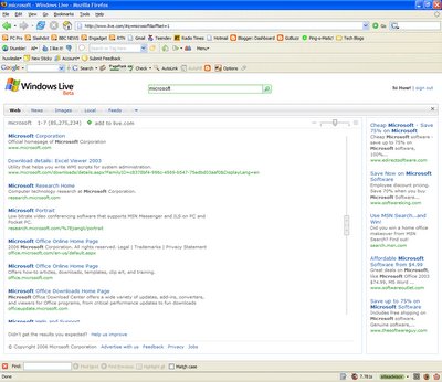
Windows Live Search beta gives you instant answers in search categories like maps, images and more. And you won’t have to click through dozens of pages to see your results—they’re all presented on one clean, easy-to-read page.
What you will be able to do with it
• Search a wide range of sources including the Web, news, local information, images and feeds.
• Search the Web or get answers about places in your area, including detailed maps—right from your cell phone
• Easy integration with your live.com homepage—save your searches and see them updated automatically
I haven't used the search for any length of time, so I can't comment on it's reliability and efficacy, although it's probably identical technology to MSN search, which produces quite good results.

I'll just talk briefly about the UI (user interface). The results page is very slick and smart, with a nice and pretty scroll bar thingy down the side. It doesn't really add that much functionality for the user, but it does mean that the search ads are always displayed, even when the page is scrolled down. They don't call them Micro$oft for nothing! It is also possible to change how much information is shown for each result, via the sliding bar in the top right-hand corner, and thus fit more results on a page. Obviously the whole system is Ajax based, but I'm not going to praise MS for that because it doesn't work in Firefox, which is ridiculous. Other than that, there's not really much difference between Live.com search or Google, or for that matter any other search engine. The search is built into the Live.com personalised homepage, in the same way that Google's is.
In conclusion, a buggy, not particularly exciting release. It is beta though, and I'm sure Microsoft will improve it over the next few weeks and months (at least I hope they will).
No comments:
Post a Comment